
02 Dec My journey with MongoDB
I realised recently that I have been doing everything all wrong for a long time. Writing scripts to send lots of REST queries to a node really isn’t an efficient way of pulling data from the Symbol chain. I was aware that you could connect directly to MongoDB but my first experience of peeking inside the catapult database last year filled me with dread and I didn’t want to poke around too much for fear that I might break something! A few weeks ago I decided to face my demons and revisit Mongo to see if I could do a little data analysis, I went a bit mad generating stats, so apologies for the length of the article! TLDR – don’t be afraid of MongoDB! 😁
For those of you that are not familiar with MongoDB (like me until a couple of weeks ago), it is a document-oriented database that stores data in a JSON-like format. If you are used to querying nodes to retrieve data then hopefully you will recognise the structure and this should be fairly easy to follow! 😁 If you want to familiarise yourself with the structure of the database before reading on then I suggest connecting to the node and exploring with the Studio 3T application.
Before you start, I would recommend setting up a separate node to query the database. I will also STRONGLY advise you *** !!! not to set openPort to true !!! *** in your symbol-bootstrap configuration – you will be exposing your node to a whole world of pain. Less than two days after changing that setting, I received my first Bitcoin ransom and the database was deleted:
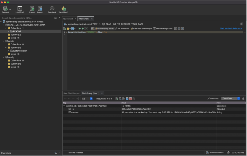
Luckily, I could just reset and resynch the node that I had specifically set up to write this article but it was a major inconvenience nonetheless. Unfortunately, I couldn’t find a way of setting up database authorisation without causing the node to fall off the network but it turns out that you can quite happily connect to mongoDB without even having to expose the port to the outside world.
In this article, I am going to explain how you can connect to MongoDB on your node, query the database and do some basic data visualisation using Python. I will cover counting, retrieving data and searching for binary values and arrays of values using pymongo. This was very much a one-man experiment so I doubt that I did things in the most efficient way and there could be some mistakes in my logic 😳. Anyway, I tried(!) and I wanted to share the experience with you in my NEM Advent Calendar article. Final disclaimer – these stats were run at varying times through late October into November 2022 so will not be up to date by the time this article is published. However, all code is provided (link at the end of the article) and can be run to generate updated stats and plots. My final piece of advice – please view this article on a desktop and not a phone!
Getting started
First, we need to import various Python modules. If you don’t have them already, you can install them all easily with pip (pip install packagename). You’ll also need to install Jupyter Notebook if you want to follow along with the code. I am guessing that Google Colab will have data storage and transfer limitations, but you may be able to use it.
from pymongo import MongoClient
import base64
from sshtunnel import SSHTunnelForwarder
import pandas as pd
import matplotlib.pyplot as plt
import matplotlib.dates as mdates
from binascii import hexlify
from symbolchain.facade.SymbolFacade import SymbolFacade
from symbolchain.CryptoTypes import PublicKey
Next, we need to connect to the node with the same login details you would use when you SSH into your server (obviously I have starred out my own login details!) Ignore the hostname here, it is definitely a mainnet API node! Here we are connecting to MongoDB that’s running on the node and using IP addresses 172.20.0.2 and port 27017. This is not accessible to the outside world and can only be connected to when logged into the Symbol node through SSH. To connect to your node you should just change the username and password and keep everything else the same. Please be aware that when you connect the database will be both read and writable so don’t write anything to the database or there will be issues.
MONGO_HOST = "symbolblog-testnet.com"

server = SSHTunnelForwarder(
    (MONGO_HOST,22),
    ssh_username='**********',
    ssh_password='**********',
    remote_bind_address=('172.20.0.2', 27017)
  )
server.start()
Once you have a connection to your node you can forward the connection back to your local machine through the SSH tunnel meaning that you can securely access the database running on your node without fear of having to pay 0.05 BTC! 😂
client = MongoClient('localhost', server.local_bind_port)
print(server.local_bind_port)
print("connected")
End of year reflections
Now we are ready to go! Let’s start with something simple, finding the total number of daily transactions. Here I am connecting to the MongoDB database catapult, this is where all of the data is stored in the form of “collections”, think of them a bit like database tables in MySQL. in this example, I am connecting to the collection “blocks” and iterating through every block on the Symbol chain. You can pull out any data you like but here I am just fetching block height, timestamp, total transaction count and total fee. I am then writing these to a tab-separated file which I will read back in again later. Just an additional note some of the later code in the Jupyter Notebook will require some of the earlier tsv files to be present as I opted to save time by not rerunning some of the big queries again and instead read them in from a file.
db = client['catapult']
collection = db.blocks
blocks = collection.find()
f = open('transactions_over_time.tsv', 'w', encoding="utf-8")
f.write("Block\tTimestamp\tTransactions\tFee\n")

for x in blocks:
    txs = x['meta']['totalTransactionsCount']
    block = x['block']['height']
    timestamp = x['block']['timestamp']
    fee = x['meta']['totalFee']
    f.write("{0}\t{1}\t{2}\t{3}\n".format(block, timestamp, txs, fee))
f.close()
This is just an example of the first 15 lines of the file created:
Block   Timestamp       Transactions    Fee
1       0       26318   0
2       84055841        0       0
3       84121147        0       0
4       84210842        0       0
5       84284892        0       0
6       84341216        0       0
7       84389750        0       0
8       84464302        0       0
9       84532050        0       0
10      84597834        0       0
11      84647088        0       0
12      84698464        0       0
13      84746666        7       114400
14      84795171        0       0
15      84845196        0       0
We can then read the tsv file and start looking at the data. I will be using pandas to store data throughout this article, if you haven’t used it before then it’s not that difficult to pick up, at least to a basic level like mine! Google is also your friend if you get a bit stuck along the way (I certainly did!).
df = pd.read_csv("transactions_over_time.tsv", sep='\t', parse_dates = ["Timestamp"])
df["Timestamp"] = pd.to_numeric(df["Timestamp"])
df["Timestamp"] = df["Timestamp"] + 1615853185000
df["Time"] = pd.to_datetime(df["Timestamp"], unit = "ms")
This may look a bit strange but after we read in the data, we convert the “Timestamp” column to a numeric value (pandas thinks it is a string), then we add the value of 1615853185000 milliseconds to the timestamp (that’s the epochAdjustment value for mainnet multiplied by 1,000 to get milliseconds from seconds – stick with me, I know it’s overly complicated! 😆). We can then calculate the actual date and time that each block was created using pandas’ to_datetime function (telling it that the timestamp is in milliseconds).
If I look at the dataframe I can see that we now have an additional column “Time” that makes that very long timestamp readable by us humans.
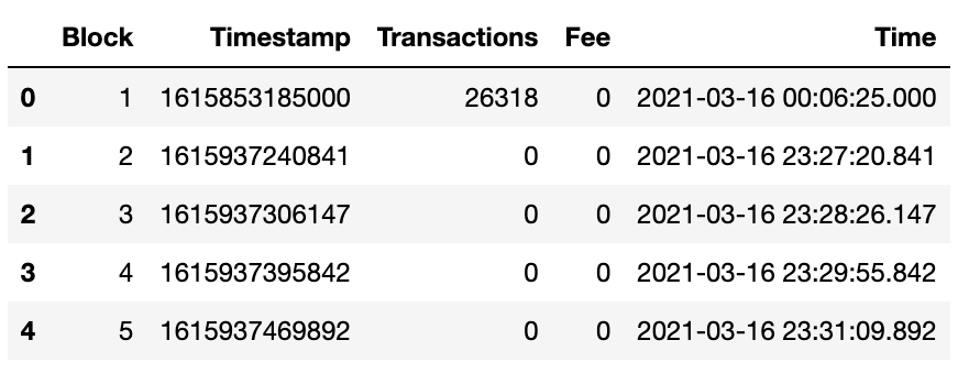
I want to make a plot so I am not really worried about the hour, minute and second that the block was produced, just the date, so we can easily add a “Date” column to the dataframe.
df["Date"] = df["Time"].dt.date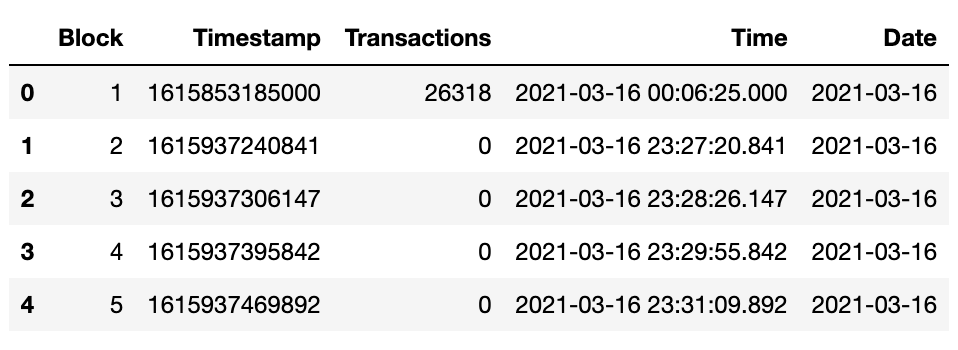
Easy! Now just to simplify this a little more I want to create a new dataframe that contains only the columns “Date” and “Transactions” and group them by date so that all transactions sent on the same day are summed into a single value:
df2 = pd.DataFrame().assign(Date=df['Date'], Transactions=df['Transactions'])
df2.columns =['Date', 'Transactions']
df2 = df2.groupby(['Date']).sum()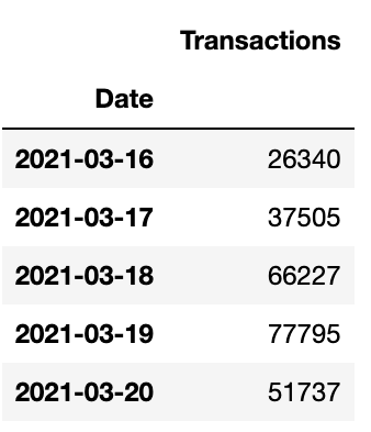
Now we’re talking! 😎 OK, so my dataframe now contains a count of all transactions sent on any given day since the network went live.
We can quite easily plot this table using matplotlib to see what it looks like:
fig, ax = plt.subplots()
df2.plot(ax=ax, color='#661D98', linewidth = '1')
ax.set_title('Daily Transactions')
ax.xaxis.set_major_locator(mdates.MonthLocator(interval=3))
ax.get_legend().remove()
plt.xlabel("Date")
plt.ylabel("Transactions")
plt.savefig('daily_transactions.png', dpi=800)
plt.show()
I haven’t prettied up these plots as I didn’t really want to focus on how to plot in matplotlib but instead concentrate on how to get data from MongoDB. Please feel free to customise your plots or show different chart types throughout.
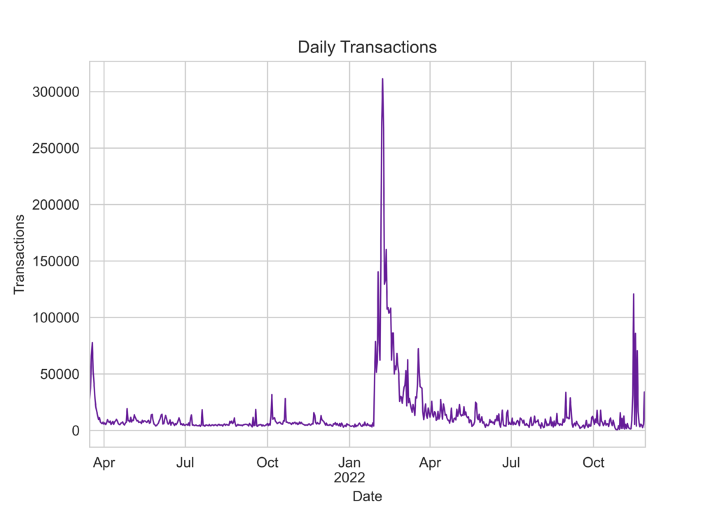
Or we can show it as a cumulative plot:
from matplotlib.ticker import FuncFormatter

def millions(x, pos):
    'The two args are the value and tick position'
    return '%1.0fM' % (x * 1e-6)

formatter = FuncFormatter(millions)

df2 = df2.cumsum()
fig, ax = plt.subplots()
df2.plot(ax=ax, color='#661D98', linewidth = '1')
ax.set_title('Daily Transactions (Cumulative)')
ax.yaxis.set_major_formatter(formatter)
ax.xaxis.set_major_locator(mdates.MonthLocator(interval=3))
ax.get_legend().remove()

plt.xlabel("Date")
plt.ylabel("Transactions")
plt.savefig('daily_transactions_cumulative.png', dpi=800)
plt.show()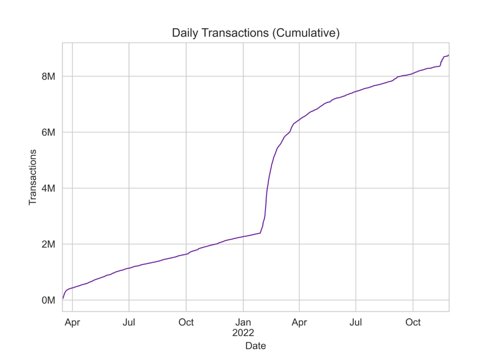
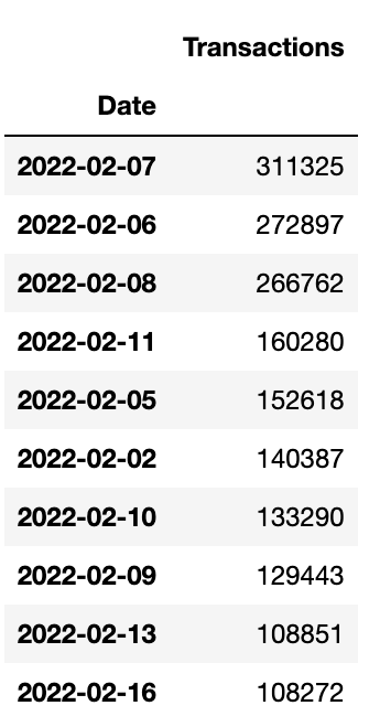
From both plots we can see that something strange happened around February 2022 and the number of transactions shot up dramatically. In fact, if we sort the table by the number of transactions per day in descending order we can see that the top 10 busiest days for transactions on the Symbol network were early-mid February of this year.
As we are looking at dates we can visualise the data as a heatmap on a calendar using the Python package calplot:
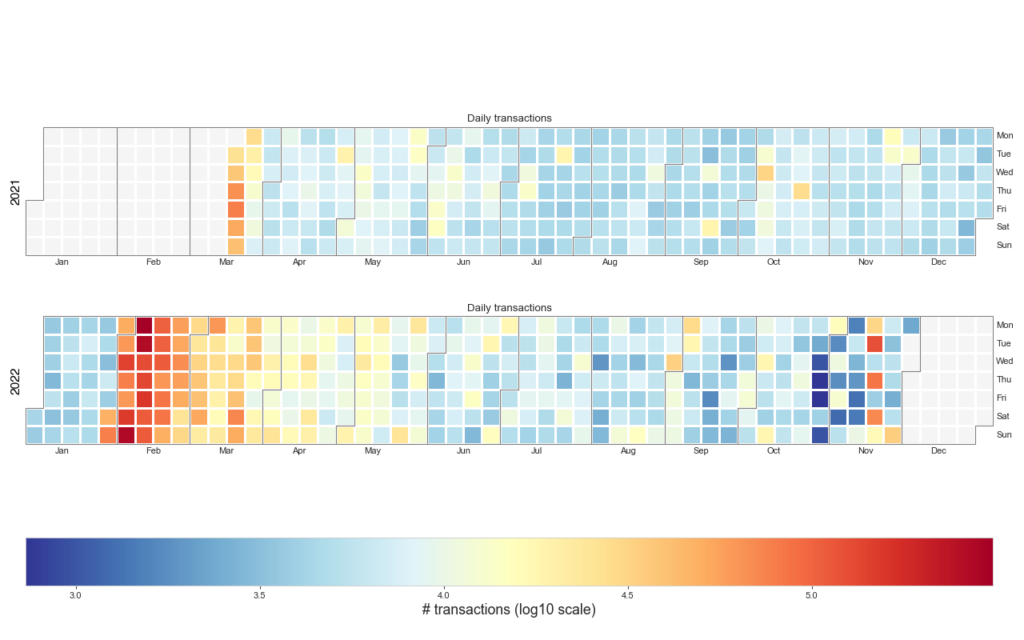
The code to make this (rather pretty if I may say so myself) plot is in the Jupyter Notebook but here are the guts of how to do it below:
import calplot
import numpy as np

plt.figure(figsize=(16,10), dpi= 80)
fig,ax = calplot.calplot(np.log10(df2['Transactions']), figsize=(16,10), yearlabel_kws={'color':'black', 'fontsize':14}, subplot_kws={'title':'Daily transactions'}, cmap='RdYlBu_r', colorbar=False)
cbar = fig.colorbar(ax[0].get_children()[1], ax=ax.ravel().tolist(), orientation = 'horizontal')
cbar.set_label('# transactions (log10 scale)', fontsize=16)

plt.savefig('daily_txs.png', figsize=(16,10), dpi= 80)
plt.show()
I can’t be 100% definite but this spike in network usage is almost certainly due to the COMSA launch on the 31st of January when lots of people created on-chain NFTs resulting in lots of transactions and quite a few full blocks. Those were the days 😁
We can use the same approach to look at network fees and block size and again we see a large spike in February.
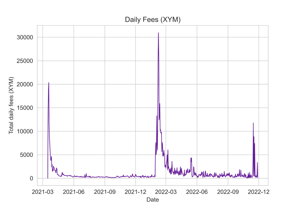
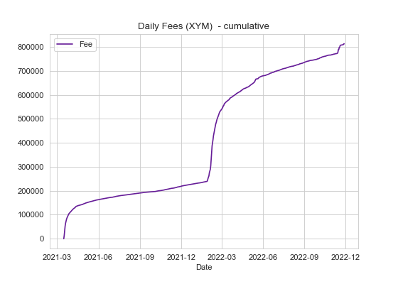
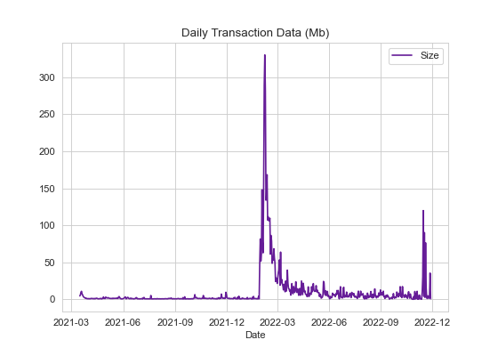
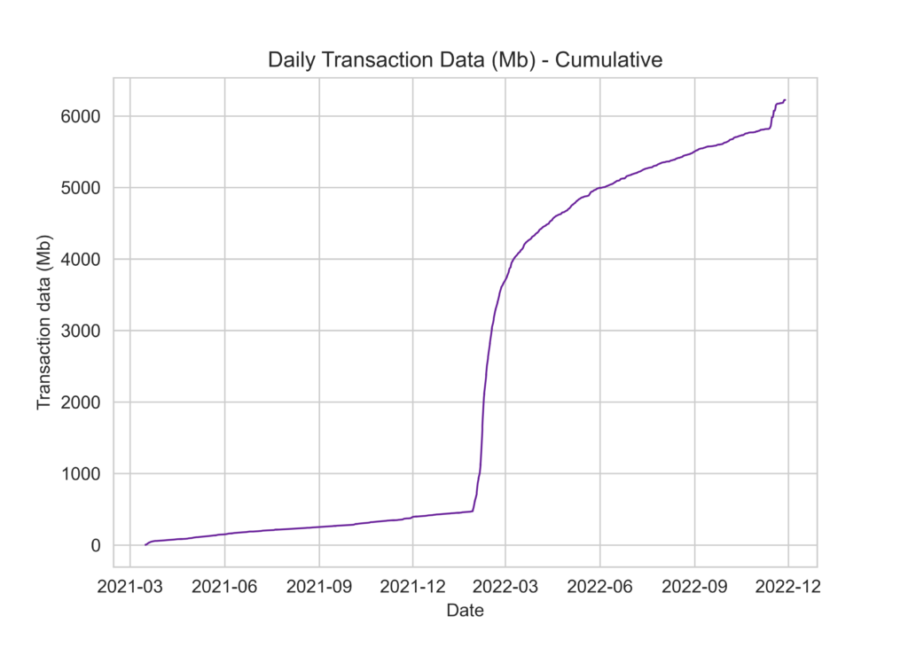
In fact, the top 10 most active days (all in February and March) generated 193,303.53 XYM in fees and wrote over 1,871Mb of data to the Symbol chain! 😬
Date	Fee (XYM)
2022-02-07	30956.722803
2022-02-06	26598.019963
2022-02-08	25524.791122
2021-03-19	20360.617173
2021-03-18	18572.737892
2022-02-11	15894.580254
2022-02-05	15053.21372
2021-03-17	13888.964051
2022-02-02	13277.537807
2022-02-10	13176.345347
Date Block data (Mb)
07/02/2022 330.20351
06/02/2022 289.141691
08/02/2022 281.000627
11/02/2022 168.355715
05/02/2022 160.096343
02/02/2022 148.012247
10/02/2022 139.118596
09/02/2022 133.966221
13/02/2022 111.521981
16/02/2022 109.648509Accounts
When looking at new account creation over time I spotted something weird 🤔 First I retrieved account address heights:
db = client['catapult']
collection = db.accounts

f = open('account_height.tsv', 'w', encoding="utf-8")
f.write("AccountID\tAddressHeight\n")

out = collection.find()

for x in out:
    aid = x['account']['address']
    aid = base64.b32encode(aid).decode('utf8')[0:39]
    block = x['account']['addressHeight']
    f.write('{0}\t{1}\n'.format(aid, block))

f.close()
Then merged these with the block information and timestamps that we downloaded earlier (transactions_over_time.tsv). So we now have a mapping from address height to the date that block (and therefore account – addressHeight) was created (or was first involved in a transaction and known to the network).
df_block = pd.read_csv("transactions_over_time.tsv", sep='\t', parse_dates = ["Timestamp"])
merged = df_accounts.merge(df_block, left_on='AddressHeight', right_on='Block')
merged.head()
Next, we can sum the number of accounts created on each day.
df_account_creation = pd.DataFrame().assign(Date=merged['Date'], AccountID=1)
df_account_creation.columns =['Date', 'AccountsCreated']
df2 = df_account_creation.groupby(['Date']).sum()
And then make a time series plot.
fig, ax = plt.subplots()
df2.plot(ax=ax, color='#661D98')
ax.set_title('Daily Accounts Created')
ax.xaxis.set_major_locator(mdates.MonthLocator(interval=3))

plt.savefig('daily_accounts.png', dpi=80)
plt.show()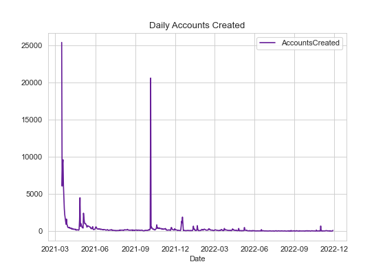
Investigating a mystery 🔍
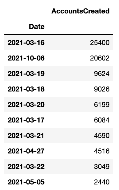
As you can see there is a weird spike in the number of new accounts on October 6th 2021. I wanted to dig a little further 🕵️♂️ First let’s get all transactions that were sent on October 6th 2021:
merged['Date'] = pd.to_datetime(merged['Date'], format='%Y-%m-%d')
filtered_df = merged.loc[(merged['Date'] == '2021-10-06')]
accounts = filtered_df['AccountID']
Next, I need to search MongoDB to get the address of all accounts that sent a transaction that day:
db = client['catapult']
collection = db.transactions
txtypes = {}
senders = {}
facade = SymbolFacade('mainnet')

search = []
for address in accounts:
    address = address + '='
    address = base64.b32decode(address.encode('utf-8'))
    b = Binary(address, subtype=0)
    search.append(b)

out = collection.find( {'transaction.recipientAddress': {"$in": search} })
for i in out:
    height = i['meta']['height']
    if (height in filtered_df['AddressHeight'].values):
        sender = str(facade.network.public_key_to_address(PublicKey((hexlify(i['transaction']['signerPublicKey']).decode('utf8')))))
        try:
            senders[sender]+=1
        except:
            senders[sender]=1

df_senders = pd.DataFrame([senders])
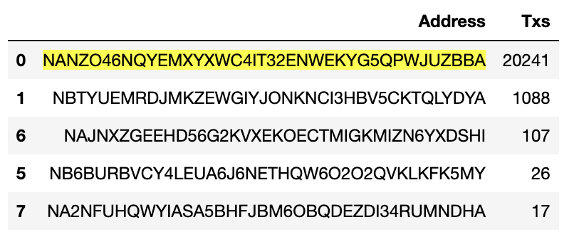
We then add the output to pandas, transpose the dataframe and finally sort from most to least transactions sent by an account:
df_senders = df_senders.transpose().reset_index()
df_senders.columns =['Address', 'Txs']
df_senders.sort_values(by='Txs', ascending=False, inplace=True)
df_senders.head()
And hey presto, mystery solved! it looks like NANZO46NQYEMXYXWC4IT32ENWEKYG5QPWJUZBBA was sending thousands of transactions of 0.000001 XYM to randomly generated addresses thus ballooning the new account numbers for that day. Why? I have no idea! 😂
Money, money, money
The next piece of code just fetches the account balances in XYM of all addresses known to the Symbol network.
db = client['catapult']
collection = db.accounts

f = open('xym_balances.tsv', 'w', encoding="utf-8")
f.write("Address\tBalance\n")

out = collection.find()

for x in out:
    y = x['account']
    z = bytes(y['address'])
    address = base64.b32encode(z).decode('utf8')[0:39]
    mosaics = y['mosaics']
    for mos in mosaics:
        if (mos['id'] == 7777031834025731064): # This is the XYM mosaic ID as a decimal value
            f.write('{0}\t{1}\n'.format(address, mos['amount']/1000000)) # Divide by 1,000,000 to obtain amount in XYM
f.close()
We can make a simple richlist and the initial query runs in seconds:
df = pd.read_csv("xym_balances.tsv", sep='\t')
# Richlist
df.sort_values(by='Balance', ascending=False, inplace=True)
df.head()
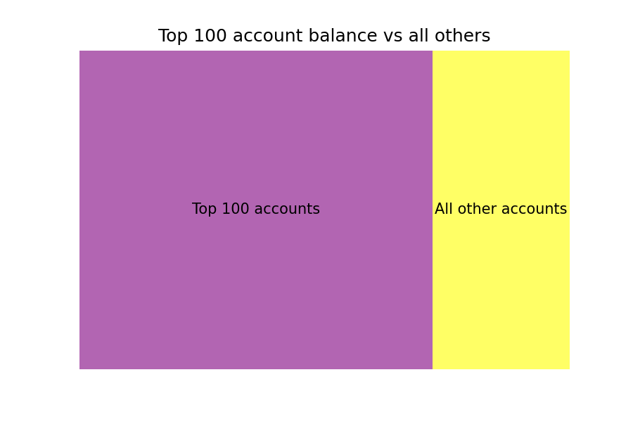
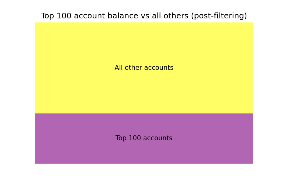
Let’s have a look at the distribution of wealth. This is a bit unfair as I am just taking all of the top 100 accounts and comparing them with all other accounts. Obviously, many of the richest accounts will not belong to individuals and will obviously include exchange addresses and the XYM treasury but hey, let’s do it anyway 😄 We can then make a very simple treemap from the data to show the proportion of wealth held by the top 100 accounts versus all others using squarify. I much prefer R for plotting rather than Python but I don’t want to overcomplicate things so basic-looking Python plots all the way in this article! 😂
import squarify    # pip install squarify if you don't already have it

top_100 = df.iloc[0:99]['Balance'].sum()
rest = df[100:]['Balance'].sum()
data = {'Name': ['Top 100 accounts', 'All other accounts'],
        'Balance': [top_100, rest]}

df2 = pd.DataFrame(data)

sizes= df2["Balance"].values
label=df2["Name"]
squarify.plot(sizes=sizes, label=label, alpha=0.6).set(title='Top 100 account balance vs all others')
plt.axis('off')
plt.savefig('top_100_accounts_vs_rest.png', dpi=150)
plt.show()
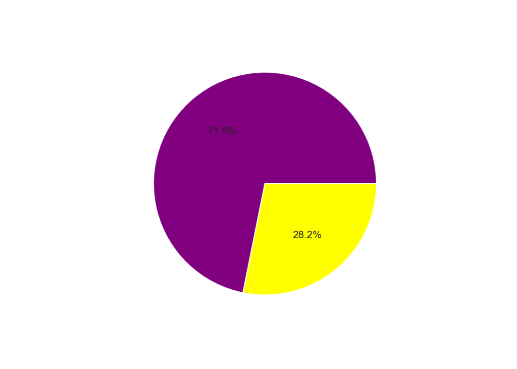
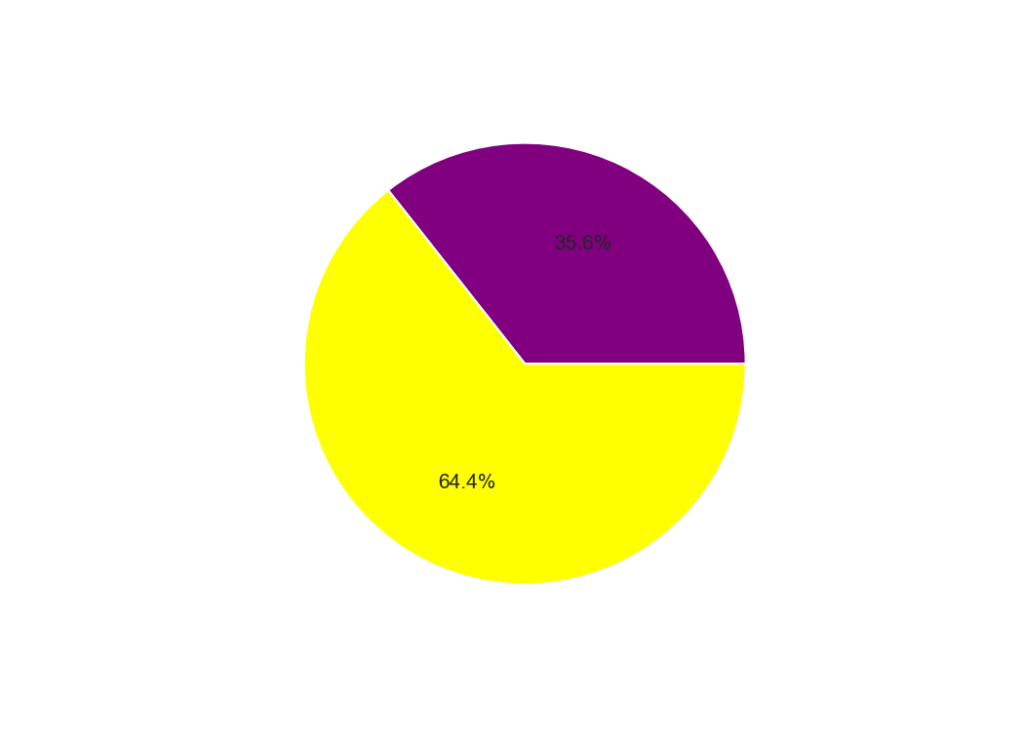
And here is the treemap plot. It’s obviously super simple as there are only two values but if I included all individual accounts it would be a complete mess, sometimes less is more, although here a simple pie chart is more informative. You can see that the majority of wealth (72%) is held by the top 100 accounts (left) but after removing the treasury and exchange accounts this number drops to 35.6%. This is still a significant skew in the distribution of wealth but not as bad. There may be other new exchange addresses in the list so it might not be completely accurate but it’s a pretty good approximation at least. I hope we will start to see a better distribution as Symbol grows.
Harvest envy
Everyone loves harvesting stats and we can grab these data directly from MongoDB, and quickly! Here I have just pulled out the addresses of all harvesters and node beneficiaries across all blocks. This is a little more complex as both the beneficiary address and the signer public key (the block harvester) are not stored as plaintext values and have to be manipulated back into a form in which we can read them. In addition, we have to use a feature of the Symbol Python SDK to convert a public key into an address.
facade = SymbolFacade('mainnet')

db = client['catapult']
collection = db.blocks
blocks = collection.find()
f = open('harvesting_info.tsv', 'w', encoding="utf-8")
f.write("Block\tTimestamp\tSigner\tBeneficiary\n")
for x in blocks:
    block = x['block']['height']
    timestamp = x['block']['timestamp']
    beneficiary = base64.b32encode((bytes(x['block']['beneficiaryAddress']))).decode('utf8')[0:39]
    signer = facade.network.public_key_to_address(PublicKey((hexlify(x['block']['signerPublicKey']).decode('utf8'))))
    f.write("{0}\t{1}\t{2}\t{3}\n".format(block, timestamp, signer, beneficiary))
f.close()
This gives us an output that looks something like this:
Block	Timestamp	Signer	Beneficiary
1713861	51546683705	NA23D2WXLBZ7RYJMCEZTPW5PZB2AMLLWRTMLHUI	NCNWCDHZC4L6F2XYN2RNCVTN2DXFLZ6VP7D7API
1713862	51546718027	NDMMZVLPOPHIS7VEJFOBZVBOQIQGEKAWUEO2ETY	NCS3SY5GERQFWOMFYI72MDQEGRWOSQOGJVFLPOI
1713863	51546732568	NCIF7UVCVCPZA7VXAX24XBHZREUCMY4TQYE35QY	NB6AAIGRL4EAN5ZXMQ74AJPURPFK7ALD6DGEWZA
1713864	51546765418	ND7L4ZPRFK7HI2JOB7TLYT32AIIOCGRRBLO7YWA	ND7L4ZPRFK7HI2JOB7TLYT32AIIOCGRRBLO7YWA
1713865	51546800833	ND3OYJKEJRSK2RTHIKQUCNXRU6YX3KZT2Y47H4A	NCUHAREH7BD2RHYEEY4BMO4ZXKLYNQF6UAX7NKY
1713866	51546830912	NDGQTI6NU4JVDJP4Q4WU4JORBMKFKGGSOJE4OEA	NAZD3SSRWZL26X3IVJLNUVWSDNHNZOYQUZWTAFY
1713867	51546856105	NCDFHVDDM43K7NQC7HN7F3U5VLTX342BZHO5BHY	NBLEY3S6UN4LGIE7MH4RRPSHQTCYMTR33Q6CLIY
1713868	51546887730	NBRPG6SMUUXY2W42DXHKBCQX3U7WLAKP2HQ6DYI	NCHENZMKQ5FIXTJTLE7AZN7SCBQF2TQ4LNVMEII
1713869	51546934229	ND5CSTMKZVCUB5WIKLWWAKXJ3EI65KQT44OB6EI	NDFKHZALC47EZSY22WX6IDNHTOWFGVFGIZ2FQWQ
1713870	51546972467	NCSWFFNRLQ4OIURKLF3Z7K6JNDABFFU5ZBELNFA	NBYFADHJBT3TDA5TZEH3C6HTZR6MZ7ED37EIPRA
One thing to keep in mind here is that the signer address is usually the linked address and not the main account of the harvester, we could fetch this but I am keeping things simple for everyone’s sake, including mine 😁 We can easily process these data to find out who the big harvesters and node owners are and to see how many times they have harvested and/or received beneficiary fees. Here I am just looking at the beneficiary address linked to the node receiving the reward, adding a count of 1 each time they receive a fee and then taking the sum of this number to get a total count of the number of times they have received a beneficiary payment.
df_harvest = pd.read_csv("harvesting_info.tsv", sep='\t')
df_node = pd.DataFrame().assign(Beneficiary=df_harvest['Beneficiary'], Count=1)
df_node.columns =['Beneficiary', 'Count']
df_node = df_node.groupby(['Beneficiary']).sum()
df_node = df_node.sort_values(by='Count', ascending=False)
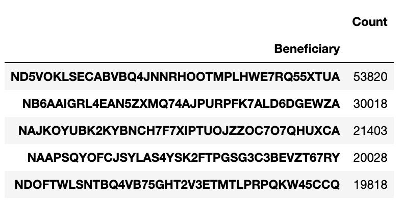
If we sort this list we can see that one lucky node owner has received 53,820 beneficiary payments since the network was launched 😮
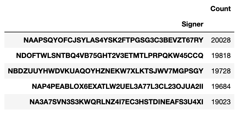
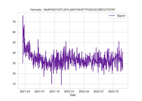
We can do the same to find the top harvesting accounts. 20,028 harvests is pretty good going and as they are running their own node they also get the node beneficiary fee too (see table on the left). Sorry for pointing out your account by the way 😉
Using this information we can also track their income over time 🕵️ You can try this for your own node or account and track your fortunes over the last year and a half by entering your own address.
 # Plot number of node beneficiary payments over time for account "ND5VOKLSECABVBQ4JNNRHOOTMPLHWE7RQ55XTUA"

query = df_harvest[df_harvest['Beneficiary'] == 'ND5VOKLSECABVBQ4JNNRHOOTMPLHWE7RQ55XTUA']
query["Timestamp"] = pd.to_numeric(query["Timestamp"])
query["Timestamp"] = query["Timestamp"] + 1615853185000
query["Time"] = pd.to_datetime(query["Timestamp"], unit = "ms")
query["Date"] = query["Time"].dt.date

df2 = pd.DataFrame().assign(Date=query['Date'], Beneficiary=1)
df2.columns =['Date', 'Beneficiary']
df2 = df2.groupby(['Date']).sum()
And make a plot:
fig, ax = plt.subplots()
df2.plot(ax=ax, color='#661D98')
ax.set_title('Beneficiary payments to ND5VOKLSECABVBQ4JNNRHOOTMPLHWE7RQ55XTUA', fontsize=10)
ax.xaxis.set_major_locator(mdates.MonthLocator(interval=3))

plt.savefig('ND5VOKLSECABVBQ4JNNRHOOTMPLHWE7RQ55XTUA.png', dpi=80)
plt.show()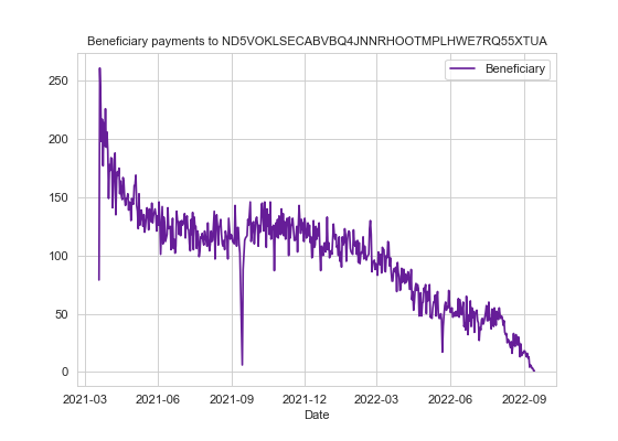
Harvest probability
This is an age-old question I see crop up all the time:
Given a balance of x, how many blocks can I expect to harvest in a week/month/year?
The chances of harvesting a block depend on your account’s importance which is almost perfectly correlated to your account balance. If we obtain the total importance of harvesting accounts and then find your share of that, then it is simple to work out how many blocks you should expect to harvest in a perfect world. Obviously, probability comes into play and you can be luckier or unluckier during a given period than someone with an identical importance score. So let’s give this a go.
First, get the relevant data from the “accounts” collection. Here I require that the account has a VRF key, a node link, and a non-zero importance score. If it has all of these then I classify it as an actively harvesting account:
db = client['catapult']
collection = db.accounts

f = open('harvesters.tsv', 'w', encoding="utf-8")
f.write("Address\tBalance\tImportance\n")

out = collection.find()

for x in out:
    try:
        address = x['account']['address']
        address = base64.b32encode(address).decode('utf8')[0:39]
        node_link = x['account']['supplementalPublicKeys']['node']
        vrf = x['account']['supplementalPublicKeys']['vrf']
        mosaics = x['account']['mosaics']
        importance = x['account']['importances'][0]['value']
        for mos in mosaics:
            if (mos['id'] == 7777031834025731064):
                f.write('{0}\t{1}\t{2}\n'.format(address, mos['amount']/1000000, importance))
    except:
        pass
f.close()
Print some basic stats:
df = pd.read_csv("harvesters.tsv", sep='\t')

# I have added the return values at time of writing in parentheses

# Number of harvesting accounts (9952)

print(len(df))

# Total harvesting account balance (1,926,106,703.32 XYM)

print(round(df['Balance'].sum(),2))

# Mean harvesting account balance (193,539.66 XYM)

print(round(df['Balance'].sum()/len(df), 2))

# Total importance harvesting (1,765,181,117,579,736)

print(round(df['Importance'].sum(),2))

# Mean importance harvesting (177,369,485,287.35)

print(round(df['Importance'].sum()/len(df),2))
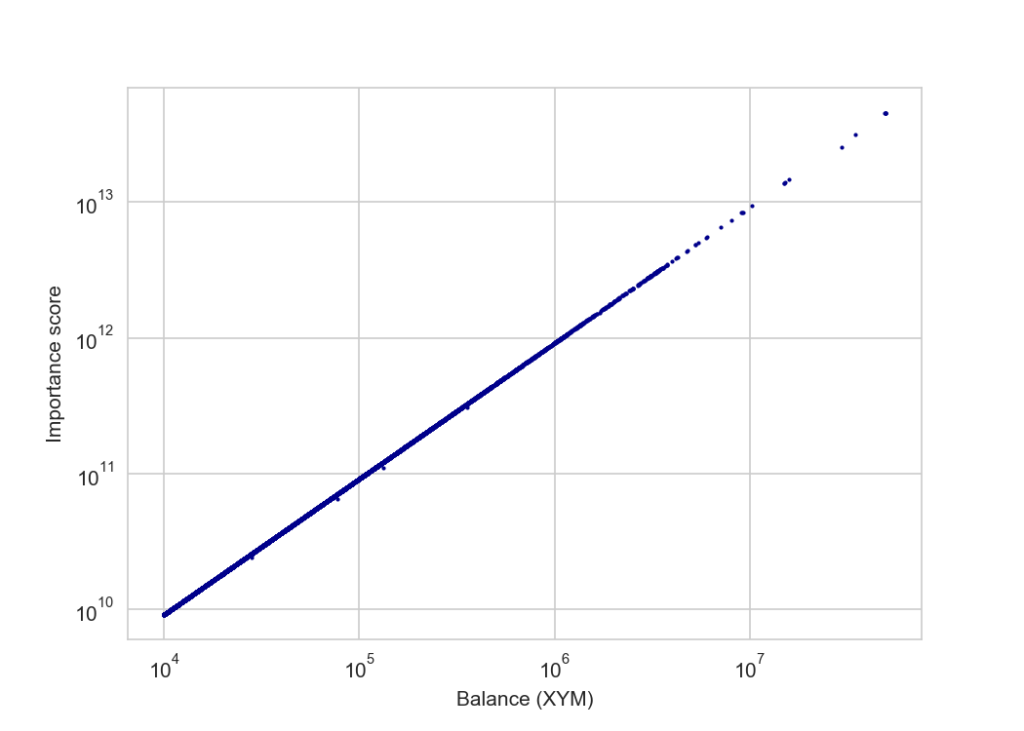
We can also plot the relationship between balance and importance:
# Plotted with a log10 scale

ax = df.plot.scatter(x='Balance', y='Importance', c='DarkBlue', s=1)
ax.set_yscale('log')
ax.set_xscale('log')
plt.xlabel("Balance (XYM)")
plt.ylabel("Importance score")
plt.savefig('balance_vs_importance', dpi=150)
plt.show()
Which shows an almost perfect positive correlation:
And still holds true at lower balances – here under 100,000 XYM where we might expect POS+ to be more noticable:
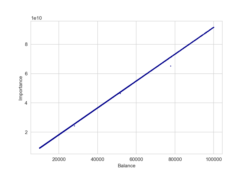
There are a few outliers where their importance is lower than their balance would suggest but upon checking, these are accounts that have bought additional XYM very recently and their importance has not just been updated to reflect their new balance.
Next we can make a simple harvesting calculator based on account’s importance score:
# Harvesting probability calculator
# Returns expected number of blocks harvested over various time periods

my_address = 'NCAY26LEBPOXM7NPCNV4HL4EH5WM6UJ5UUN4UGA'
my_details = df.loc[df['Address'] == my_address].reset_index(drop=True)
my_details = my_details.to_dict()
my_importance = my_details['Importance'][0]
total_importance = df['Importance'].sum()
my_ratio = my_importance/total_importance
daily_blocks = 2880
daily_prob = round(my_ratio * daily_blocks, 2)
weekly_prob = round(my_ratio * daily_blocks * 7, 2)
monthly_prob = round(my_ratio * (daily_blocks * 365)/12, 2)
yearly_prob = round(my_ratio * daily_blocks * 365, 2)

print("Account:{0}\nDaily: {1}\nWeekly: {2}\nMonthly: {3}\nYearly: {4}".format
      (my_address, daily_prob, weekly_prob, monthly_prob, yearly_prob))
Which, for the Symbol Blog account returns:
Account: NCAY26LEBPOXM7NPCNV4HL4EH5WM6UJ5UUN4UGA
Daily: 0.06
Weekly: 0.39
Monthly: 1.7
Yearly: 20.46
Down for the count
So far I have been searching collections and pulling back data but sometimes all you need to do is count. In the example below I just want to know how many transactions of each type have been sent on the Symbol network. It’s actually a dumb example as I think it’s probably highly inefficient in this case because I am counting within a loop. I think that that I can do something clever with aggregation in pymongo but I haven’t learnt that yet! 😅
# Transaction types are taken from https://docs.symbol.dev/serialization/index.html#transactiontype
# They are in hex format but in MongoDB they are stored as integers so we need to convert, Python can
# Do this faster than I can! :D

tx_mapping = {
int(b'0x414c', 16): "ACCOUNT_KEY_LINK",
int(b'0x424c', 16): "NODE_KEY_LINK",
int(b'0x4141', 16): "AGGREGATE_COMPLETE",
int(b'0x4241', 16): "AGGREGATE_BONDED",
int(b'0x4143', 16): "VOTING_KEY_LINK",
int(b'0x4243', 16): "VRF_KEY_LINK",
int(b'0x4148', 16): "HASH_LOCK",
int(b'0x4152', 16): "SECRET_LOCK",
int(b'0x4252', 16): "SECRET_PROOF",
int(b'0x4144', 16): "ACCOUNT_METADATA",
int(b'0x4244', 16): "MOSAIC_METADATA",
int(b'0x4344', 16): "NAMESPACE_METADATA",
int(b'0x414d', 16): "MOSAIC_DEFINITION",
int(b'0x424d', 16): "MOSAIC_SUPPLY_CHANGE",
int(b'0x434d', 16): "MOSAIC_SUPPLY_REVOCATION",
int(b'0x4155', 16): "MULTISIG_ACCOUNT_MODIFICATION",
int(b'0x424e', 16): "ADDRESS_ALIAS",
int(b'0x434e', 16): "MOSAIC_ALIAS",
int(b'0x414e', 16): "NAMESPACE_REGISTRATION",
int(b'0x4150', 16): "ACCOUNT_ADDRESS_RESTRICTION",
int(b'0x4250', 16): "ACCOUNT_MOSAIC_RESTRICTION",
int(b'0x4350', 16): "ACCOUNT_OPERATION_RESTRICTION",
int(b'0x4251', 16): "MOSAIC_ADDRESS_RESTRICTION",
int(b'0x4151', 16): "MOSAIC_GLOBAL_RESTRICTION",
int(b'0x4154', 16): "TRANSFER"
}

tx_count = dict.fromkeys(tx_mapping, 0)

f = open('tx_types.tsv', 'w', encoding="utf-8")
f.write("txType\tcount\n")
db = client['catapult']
collection = db.transactions

# This time rather than loop through every transaction and check its type I am using "count_documents"
# to return the number of occurances of each tx type in the collection. It actually doesn't seem to be any/much
# faster though!! Guess as I am running this in a loop it probably cancels out any speed up
# I could search for a list but not sure how to split them back into individual queries rather than a sum of matches

for types in tx_count:
    out = collection.count_documents({'transaction.type': types})
    print("{0}: {1}".format(tx_mapping[types], out))
    f.write("{0}\t{1}\n".format(tx_mapping[types], out))
f.close()
Then we can read in our tsv to a dataframe and plot the results.
df = pd.read_csv("tx_types.tsv", sep='\t')

fig, ax = plt.subplots(figsize=(10, 10))
# Create a pieplot
plt.pie(df['count'])

# add a circle at the center to transform it in a donut chart
my_circle=plt.Circle( (0,0), 0.7, color='white')
p=plt.gcf()
p.gca().add_artist(my_circle)

ax.legend(df['txType'],
          title="Transaction type",
          loc="center left",
          bbox_to_anchor=(1, 0, 0.5, 1))

plt.show()
Et voila! We have a donut chart showing the breakdown of transaction types (really should have used better colours and a different plot type) 🙈 As expected we see that transfer transactions make up the bulk of the total transactions sent,
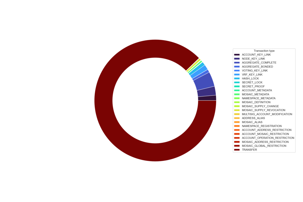
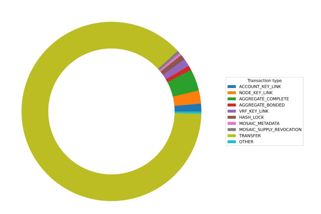
It’s a little clearer if we just add an “other” category for transaction types with fewer than 10,000 counts:
QUEST: the keeper of secrets
You can build up quite complex queries by wrangling data in Python. Here I am interested in getting all secret lock transactions and, where available, their corresponding unlock transactions. Now I could loop over all 8 million plus entries in the transaction collection but that would take a while (maybe about 15 minutes?). It is much faster to use the power of MongoDB and return only the transactions that you are interested in. In our case secret proof (tx type 16978) and secret lock (tx type 16722). This should make the whole process run in seconds and ultimately, we will have a linked set of lock and unlock hashes, the amount sent and the public key of the account that unlocked the transaction.
f = open('output_secret_locks2.tsv', 'w', encoding="utf-8")

db = client['catapult']
collection = db.transactions

out = collection.find({'transaction.type': 16978}) # Secret proof

lockHashes = {}
unlockHashes = {}
unlockPubKey = {}

for x in out:
    proofPublicKey = hexlify(x['transaction']['signerPublicKey']).decode('utf8')
    secret = hexlify(x['transaction']['secret']).decode('utf8')
    if ('hash' in x['meta']):
        hash = hexlify(x['meta']['hash']).decode('utf8')
        unlockHashes[secret]=hash
        unlockPubKey[secret]=proofPublicKey

    elif  ('aggregateHash' in x['meta']):
        hash = hexlify(x['meta']['aggregateHash']).decode('utf8')
        unlockHashes[secret]=hash
        unlockPubKey[secret]=proofPublicKey


out = collection.find({'transaction.type': 16722})

for x in out:
    amount = 0
    lockPublicKey = hexlify(x['transaction']['signerPublicKey']).decode('utf8')
    secret = hexlify(x['transaction']['secret']).decode('utf8')
    lockHashes[secret] = {}

    if (x['transaction']['mosaicId'] == 7777031834025731064): # mosaicID == XYM
        amount = x['transaction']['amount']/1000000

    if ('hash' in x['meta']):
        hash = hexlify(x['meta']['hash']).decode('utf8')
        lockHashes[secret]['hash'] = hash
        lockHashes[secret]['amount'] = amount
        lockHashes[secret]['lockPublicKey'] = lockPublicKey

    elif ('aggregateHash' in x['meta']):
        hash = hexlify(x['meta']['aggregateHash']).decode('utf8')
        lockHashes[secret]['hash'] = hash
        lockHashes[secret]['amount'] = amount
        lockHashes[secret]['lockPublicKey'] = lockPublicKey

f.write("LockPubKey\tLockHash\tUnlockHash\tAmount\tSecret\tProofPubKey\n")

for x in lockHashes:
    if (x in unlockHashes):
        lockPubKey = lockHashes[x]['lockPublicKey']
        lockHash =  lockHashes[x]['hash']
        amount = lockHashes[x]['amount']
        unlockTx = unlockHashes[x]
        proofPubKey = unlockPubKey[x]
    f.write("{0}\t{1}\t{2}\t{3}\t{4}\t{5}\n".format(lockPubKey, lockHash, unlockTx, amount, x, proofPubKey))
f.close()
I am actually going to use this information to find out the percentage of secret lock transactions on the network that were initiated on the QUEST platform and to find out the total amount of XYM boosted on QUEST. To give some background, when a user boosts a quest they send a transaction fee to the QUEST platform and a secret lock transaction with the boost amount directly to the performer. If the quest is completed successfully then the QUEST platform will send an unlock transaction with the secret proof which in turn will release the funds to the performer.
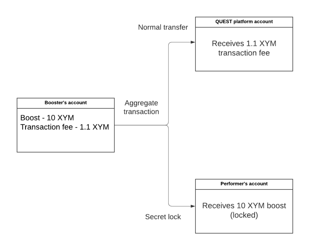
With some basic detective work I know that the public key of the QUEST platform account that performs the unlock transactions is 096122224a49fd3127f358b036d45cbf99037bf652b02a697d9973d8ed246373 you can see the account on the explorer here. So let’s read in the tsv file see how many quests have been successfully boosted and the total amount donated 🕵️.
df_secrets = pd.read_csv("output_secret_locks2.tsv", sep='\t')We can extract those transactions that were unlocked by the QUEST platform account:
query = df_secrets[df_secrets['ProofPubKey'] == '096122224a49fd3127f358b036d45cbf99037bf652b02a697d9973d8ed246373']And count them just by looking at the length of the dataframe:
len(query)At time of writing there were 2,850 unlock transactions initiated by the QUEST account from a total of only 3,140 unlock transactions on the network. This means not only that there have been 2,850 successful QUEST boosts but also that these account for over 90% of all of the secret-proof transactions on the network!
sum(query['Amount'])If we sum the “Amount” column in the QUEST subset then we see at the time of writing, that 415,257.59 XYM has been sent to performers by their supporters on the platform.
Exchange fun
There is a list of all known Symbol exchange addresses here, so we can use this to look at inflow and outflow of funds over time. I have included these in the Jupyter Notebook but they aren’t that interesting so I wanted to show some Sankey diagrams and show you how to plot them. Note: I am not sure if the list is up to date as I don’t see any Zaif entries in recent times and there may also be new exchange accounts that are not labelled.
First we create a dictionary of exchanges and addresses:
exchange_accounts = {
    "NAJNXZGEEHD56G2KVXEKOECTMIGKMIZN6YXDSHI": "Binance",
    "NBM3VN6JHD3WEUQAJSKAAXWDPDJ3BP6Q3C44RWI": "Bitbns",
    "NACKUY7MRZFRARP4VU2JR7EXX4NBGCDV62NUCAY": "Bitflyer",
    "NBFSOUJHEHKKTV5I4IDWBREAEE3PCUY2TELNL5Q": "Bitflyer - withdrawals",
    "NBJNDXDKK4MHMRFTXCWUQBWOEJVW4GZNRIJT3CY": "Bitflyer",
    "NDLSY2ZHQO5BR7SYC6I3YCGAW4WYZCFUCX6PIZY": "Bitflyer",
    "NCFNYXJR6SPZDCWHDXHBRZYILFCK5KYK6YHYVVY": "Bithumb",
    "NAXKLQW6KQ4MPDZCD67REUT4MCZDC6QMG5BMB7Q": "Bithumb",
    "NBKLAO67AHAG62NP3PTOKSQ2NYUNQXP2QW2B7YA": "Bithumb",
    "NAGR2737EJ67DGCGNSGD6SARG5TE2G7N5AMXHUA": "Bittrex - withdrawals",
    "NCZ3NVVJPRECZXWKGF2HBNQ5A6VDT2Y7JZXPBTA": "Coincheck",
    "NAMYQXVBMLQ5HLYK3GQLMKFDLHGIXPPAU5VGFOI": "Continuity Fund",
    "NDRHEQCD3HADMSJMC3IYGM5PXKWYA5ENTE6Z3BY": "Copper",
    "NATG4T47GT5U7SZ5ACFZMPXZJ4M7CFOBJ3OOI5I": "Crex24",
    "NCEURSTWQ3YY54QKFDHX64XZJ54JQZ4COG2VFLA": "Gate.io",
    "NBWKVE7QG7TNNPSHRKUP2BYQWMOGJBHI3DO4OTY": "Gate.io - withdrawals",
    "NBP3RSQYUGTLM5D3WQSY3S2SQOJFNU5POM4VNTA": "GraviEX",
    "NBXQQXO3IFS3FMHPGJ4DLO2GTZ42AFQRMUTQFUA": "HitBTC",
    "NBZXE3GAYVANLMPNVKHOZDPOEVTYKEF2UNZTTQI": "HitBTC",
    "NDFWJQPVYQQWVWXJ2E3Q4242EDJMY3ZF7AHPRCA": "HitBTC",
    "NAB7WGVOYEX6BO3AAAO2SRRXLX77FW2Z72C7ECY": "HitBTC",
    "NAOQY53IQOPDCROYCRWR7ATRHKR3T4UP5VKXMDA": "HitBTC",
    "NDK7WC5XJNM3U267KZ4ONW6EJXJM2YPAIBBSV3A": "Huobi",
    "NCZ6ZY3VLOJMGOS7YZQHFHIAZIX4WN7IJ3HMCKI": "Huobi",
    "NCIG65BEOUJPH2AP7ELHOPYIH7FANQEH5CCOBEI": "Huobi",
    "NAMLAHSCDBVVCOP65FEL4C63ZFH3YTNMMKN425A": "Kuna",
    "NCCYOIBBTCEYB4DQ4IU5K7LOXF3QSXEVQ5GX5HI": "Okex",
    "NCZIHJERR3FXDPA46PEGBC3FM275EOS3557MLVA": "Poloniex",
    "ND4D3TWGBR6WEMLBIYZ3O2Q4V7BCEUMZMLTTPEQ": "Poloniex",
    "NBGWP2QCEMQF7RS3IJCPK6EHHMMM3M6465ANFLY": "Spectrocoin",
    "NCTMD3DYT4AFVRQDBSLIEO3COL4GNCANRUDQPTQ": "Upbit",
    "NC5LVD7FX2DNM2Y7LHDFUEOOC5BT2Z2O7TUKDGQ": "XTcom",
    "NAWHAPMFJT2FFH3ONGCLG3TVGUJY3PZUBAOFLBA": "Yobit",
    "NDTCXC6GCUTYKF6TED3AESZYHNZFUYEVNZR66KI": "Zaif",
    "NDZ5DOXCK444ZTWLUZ672B4TWFNU6GKNFG2CKII": "Zaif",
    "NC6XRCOQEIHCX4X3AVXXNCKZUXPSQAIZIK4INZI": "Zaif",
    "NC6OVRVNRWH7ZXBCVJI25SIBHSWJOWZWD2CBJIY": "Zaif",
    "NBVU44NKAED5MLPEY4Y7Z5OMUAUXLYI7HOIKNSY": "Zaif - deposits",
    "NA2NFUHQWYIASA5BHFJBM6OBQDEZDI34RUMNDHA": "Zaif - withdrawals",
    "NCAFYUO7PW3F45PSH6QRBM6GUXYUVK3H3NSTKBI": "Kucoin - deposits",
    "NBO3IWAQTEQDPXV5AT3ORVUXBEBQSQZS6363GJY": "Kucoin - withdrawals",
    "NDIZ62F6HYKZ5XJWXN5US77TNXXT4O5MNSQANOI": "AEX – deposits",
    "NDWFN7HB26H2W64VVSIPENKNAUMBLWCIXTO4EYA": "AEX - withdrawals",
    "NBLBX3CQLKYJHHIRO4FLKBJFPAOSQS2WFAOAKLA": "Bitrue",
    "NCKT7NCR4FVRXHRYPCUYBO3NXRY6SOGYRT5I3BA": "Xtheta - deposits",
    "NCKFOIWN57KEET6YZE7EMZMWZB34NW6PGHHNCXQ": "Xtheta - withdrawals",
    "NDJLQEQOI33GADMF6TACW3ATDEJAECC56RGESTA": "HitBTC, Changelly - deposits",
    "NAGME7T4FZJCTNM5CIYTAVYMOSYAHL5OU7A7DVI": "HitBTC, Changelly - withdrawals",
    "NBBHSNE2VMQGVZYKQIYYEDJIRETDDEWACTVN3UA": "Probit",
    "NAHM4SXXSOYDDXXF62Z6FYY7HIGMQDB3PNVXSUQ": "ProBit - deposits",
    "NCPWZEHOK4BCYD7U3X5RLMSBBYNFCIIZO7ULF2Q": "ProBit - withdrawals",
    "NBHZDPANNKXYRYXSF4DJOT7MDU2QAEAD67UAK6Y": "ZB.com - withdrawals",
    "NCBL5ZC63VPB6KUXQIDZA7ZLMFEDS3YXJXAFDVA": "Latoken",
    "NCZLP3L74IFMSPA4D3KZSUVBS2LZPV4QDZUQUIY": "CoinEx - withdrawals",
    "NDURU3U7Y7KKTPC2VVVF6U3VJIU5HDWSHQZCS4Q": "Bitbank - deposits",
    "NAIJUACP6BKCMFV7C7IDSZSAD7UNBMAE3TM7JKY": "Bitbank - withdrawals",
    "NBBPI4VHOYDE2ALKZSCGSXJODAJS3S6LYG3N6XI": "Bybit - deposits",
    "NCSSLGWTRKULNZEGJSXHGRB2N7YMDDUCDOPUFCA": "Bybit - withdrawals",
    "NABGDANLKUZ3D2SQOUEKPGYI6OAUFHEDW233FKY": "MEXC - withdrawals",
    "NC5HR72OBBVOCQBZTOKW4JJRXDRJP32FEI5J7RI": "Upbit",
    "NB7QHADUMZ5QQEX37A4XTADCBWRPYSLUSUGAMQI": "Upbit",
}
Next, we find all transactions which involved one of the exchange addresses:
import base64
from bson.binary import Binary

facade = SymbolFacade('mainnet')

db = client['catapult']
collection = db.transactions
count = 0
txs={}
search= []

for address in exchange_accounts:
    address = address + '='
    address = base64.b32decode(address.encode('utf-8'))
    b = Binary(address, subtype=0)
    search.append(b)

out = collection.find( {'meta.addresses': {"$in": search} })
for i in out:
    height = i['meta']['height']
    try:
        for mosaic in i['transaction']['mosaics']:

            if mosaic['id'] == 7777031834025731064:
                count+=1
                amount = mosaic['amount']/1000000
                recipient = i['transaction']['recipientAddress']
                recipient = base64.b32encode(recipient).decode('utf8')[0:39]
                sender = str(facade.network.public_key_to_address(PublicKey((hexlify(i['transaction']['signerPublicKey']).decode('utf8')))))
                if recipient in exchange_accounts:
                    txs[count] = {}
                    txs[count]['height'] = height
                    txs[count]['amount'] = amount
                    txs[count]['recipient'] = exchange_accounts[recipient]

                    if sender in exchange_accounts:
                        txs[count]['sender'] = exchange_accounts[sender]
                    else:
                        txs[count]['sender'] = sender

                else:
                    txs[count] = {}
                    txs[count]['height'] = height
                    txs[count]['amount'] = amount
                    txs[count]['recipient'] = recipient

                    if sender in exchange_accounts:
                        txs[count]['sender'] = exchange_accounts[sender]
                    else:
                        txs[count]['sender'] = sender
    except:
        pass

df_txs = pd.DataFrame(txs)
df_txs = df_txs.transpose()
Next, we merge with the df_block data we generated earlier to get the date each transaction was sent.
merged = df_txs.merge(df_block, left_on='height', right_on='Block')
merged.reset_index()
merged['Date'] = pd.to_datetime(merged['Date'])
merged.set_index('Date', inplace=True)
There are a lot of transactions so I will select only those within a specific date range. In this case 1st to the 31st of October.
# Let's get all exchange transactions between 1st and 14th November

df = merged.loc['2022-10-01':'2022-10-14']
flows = df[['recipient', 'sender', 'amount']].reset_index()
flows.drop(['Date'], axis=1, inplace = True)
flows.head()
Now I am renaming the columns to be compatible with the floweaver package that I will use to create the Sankey plots.
flows = (
    flows.rename(
        columns={
            "sender": "source",
            "recipient": "target",
            "amount": "value",
        }
    )
)
Set the font size to 10 point.
%%html
<style>
.sankey .node {
    font-size: 10pt;
}
</style>
Import floweaver and make the plots.
from floweaver import *
from ipysankeywidget import SankeyWidget

nodes = {
    "recipient": ProcessGroup(flows["source"].unique().tolist()),
    "sender": ProcessGroup(flows["target"].unique().tolist()),
}
ordering = [["sender"], ["recipient"]]
bundles = [Bundle("sender", "recipient")]

# Create partitions
sender = Partition.Simple("process", flows["source"].unique().tolist())
recipient = Partition.Simple("process", flows["target"].unique().tolist())

nodes["sender"].partition = sender
nodes["recipient"].partition = recipient

# Create Sankey diagram
sdd = SankeyDefinition(nodes, bundles, ordering)
size_options = dict(width=2200, height=2000, margins=dict(left=350, right=350, top=10, bottom=10))
#weave(sdd, flows, link_color=QuantitativeScale("value")).to_widget(**size)

weave(sdd, flows, link_color=QuantitativeScale("value")).to_widget(**size_options).auto_save_svg('test.svg')
And here we are, the finished product! All flows are occuring from left to right and the thickness and colour of the ribbon represent the amount moved. The account labels are a bit messy. Maybe I should just remove the non-exchange account labels but I will let you play around with this 😊

This shows all exchange movements involving transactions over 1 million XYM:

These diagrams can get really complex so this is another example of less is more. We can just label all non-exchange accounts as “customers” and then we have a less cluttered plot showing funds moving into and out of exchanges.

Aggregate bonded scam
Plotting this diagram was a pain in the ass both using floweaver and plotly (which I ended up using below). I have some code in the Jupyter Notebook and after a LOT of head-scratching, I think it is correct (hallelujah!). Even if it isn’t perfect it does demonstrate the flow of funds into and out of the scammers’ accounts. The data comes from this spreadsheet created by Anthony but there may be additional scammer addresses that are not on the list. In this example I have just searched for aggregate bonded scams that originate from addresses in the scammer list and then looked at where those funds were moved to, I have set a threshold of 100 XYM so any movements below that amount will not be included in the plot. It is possible to extend this out and look for further transactions from the next level of addresses to see where the funds end up but that’s enough for me now! 😁
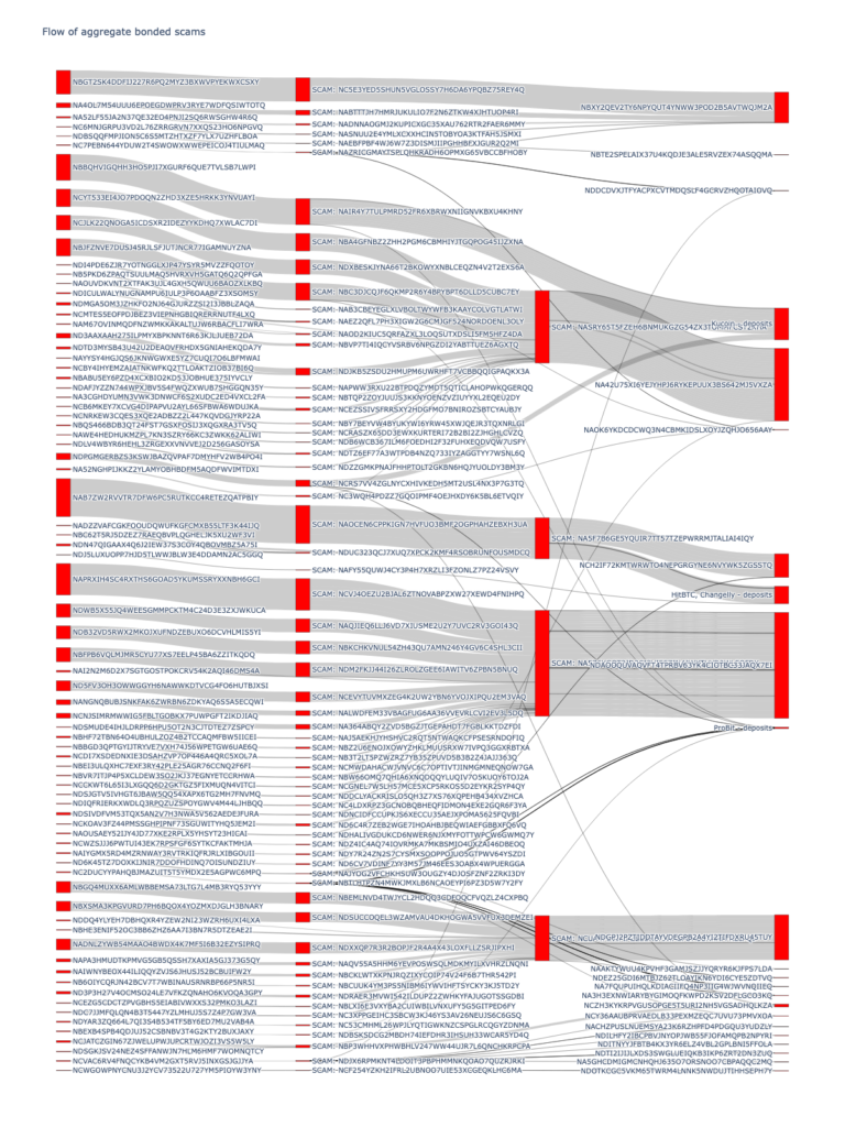
The version in the Jupyter Notebook is interactive so when you run it you can hover over the links and it will show you the amounts transferred. I’ve also linked to the interactive version here.
See who your friends are
A lot of the data stored in MongoDB are represented as binary values. It took me a long time to work out how to search for these using pymongo so I will try to explain in the example below. Here I have searched for all transactions involving the Symbol Blog address NCAY26LEBPOXM7NPCNV4HL4EH5WM6UJ5UUN4UGA. As these values are stored in a binary format in MongoDB we need to prepare the query value accordingly. There are some key points to consider when doing this and I will try to explain these in more detail.
The first thing that we need to consider is that the addresses in MongoDB are stored as hex values. In order to convert a Symbol address such as NCAY26LEBPOXM7NPCNV4HL4EH5WM6UJ5UUN4UGA to hex we need to append an “=" character to the end of the address (this is automatically removed when converting hex to address so we need to add it back on). Once we have the hex address we import the BSON Binary package and use this to encode our query value so that it can be used in the same way as a regular query to MongoDB. Next, we need to add some code to convert our binary values back to an address after we retrieve them from the database. In the example below I am fetching all accounts that have transacted with Symbol Blog (this only includes regular transfers, not aggregates) and I have stored the results in a pandas dataframe, from which I am going to make a graph showing inputs and outputs from my account.
import base64
from bson.binary import Binary
db = client['catapult']
collection = db.transactions

my_address = 'NCAY26LEBPOXM7NPCNV4HL4EH5WM6UJ5UUN4UGA' + '='
search = base64.b32decode(my_address.encode('utf-8'))

count = 0

output_dict = {}

# Could add amount too

out = collection.find({'meta.addresses': Binary(search, subtype=0)})
my_address = my_address[0:39]
for x in out:
    try:
        count += 1
        output_dict[count] = {}
        addresses = (x['meta']['addresses'])
        height = (x['meta']['height'])
        recipient = x['transaction']['recipientAddress'] ## Need a try
        recipient = base64.b32encode(recipient).decode('utf8')[0:39]
        if (recipient != my_address):
            output_dict[count]['sender'] = my_address
            output_dict[count]['recipient'] = recipient

        for y in addresses:
            address = base64.b32encode(y).decode('utf8')[0:39]
            if ((address != my_address) & (my_address == recipient)):
                output_dict[count]['sender'] = address
                output_dict[count]['recipient'] = my_address
    except:
        pass


df = pd.DataFrame(output_dict)
# Add dictionary to pandas
df = df.transpose()
df['txs'] = 1
df = df.groupby(['sender','recipient']).txs.count().reset_index()
df.head()
So now we can make our network from the dataframe that we created. Each row has a sender and a receiver address with the tx column counting the number of times that this transaction between sender and receiver has occurred.

There are many different Python packages we can use to make a graph showing these interactions but I chose pyvis since it allows interactive visualisation. First, we set up our nodes (sender and recipient accounts) and then we link them in a directed graph showing which account was the sender and which was the recipient. I have used the txs column of my dataframe to represent a weight so, for example, if Bob sent 5 transactions to my account then the edge between my node and Bob’s would appear thicker than the edge between my account and Charlie’s who has only sent a single transaction to my account.
from pyvis.network import Network

network = Network(height="1024px", width="100%", bgcolor="#222222", font_color="white", directed=True)

# set the physics layout of the network
network.barnes_hut()

sources = df['sender']
targets = df['recipient']
weights = df['txs']

edge_data = zip(sources, targets, weights)

for e in edge_data:
                src = e[0]
                dst = e[1]
                w = e[2]

                network.add_node(src, src, title=src)
                network.add_node(dst, dst, title=dst)
                network.add_edge(src, dst, value=w)

neighbor_map = network.get_adj_list()

# add neighbor data to node hover data
for node in network.nodes:
                node["title"] += " Neighbors:<br>" + "<br>".join(neighbor_map[node["id"]])
                node["value"] = len(neighbor_map[node["id"]])

network.show("test.html")
And here is what the graph looks like:
You can see that Symbol Blog is in the centre of the universe(!) and all of the accounts that I have transacted with revolve around me 😂 You can zoom in and out and at higher zoom levels the account labels become visible. It’s a bit like those Chirpty Twitter diagrams but for Symbol accounts 😁
It is also possible to expand the plot to include all transactions from the accounts that transacted with the Symbol Blog address. This code is identical to what we had above but I have just added a couple of lines to store all unique addresses that have transacted with Symbol blog as a set: all_accounts.
# Now get one degree of separation

import base64
from bson.binary import Binary
db = client['catapult']
collection = db.transactions

my_address = 'NCAY26LEBPOXM7NPCNV4HL4EH5WM6UJ5UUN4UGA' + '='
search = base64.b32decode(my_address.encode('utf-8'))
all_accounts = set()
count = 0

output_dict = {}

# Could add amount too

out = collection.find({'meta.addresses': Binary(search, subtype=0)})
my_address = my_address[0:39]
for x in out:
    try:
        count += 1
        output_dict[count] = {}
        addresses = (x['meta']['addresses'])
        height = (x['meta']['height'])
        recipient = x['transaction']['recipientAddress'] ## Need a try
        recipient = base64.b32encode(recipient).decode('utf8')[0:39]
        if (recipient != my_address):
            output_dict[count]['sender'] = my_address
            output_dict[count]['recipient'] = recipient
        for y in addresses:
            all_accounts.add(y)
            address = base64.b32encode(y).decode('utf8')[0:39]
            if ((address != my_address) & (my_address == recipient)):
                output_dict[count]['sender'] = address
                output_dict[count]['recipient'] = my_address
    except:
        pass


df = pd.DataFrame(output_dict)
# Add dictionary to pandas
df = df.transpose()
df['txs'] = 1
df = df.groupby(['sender','recipient']).txs.count().reset_index()
df.head()
Using the set of accounts we can do something pretty cool and query MongoDB using an array of binary data (this took me a lot of trial and error to work out – the documentation isn’t great!). The set of accounts in all_accounts needs to be converted into a BSON binary object and then we can add these to a regular list and search for that list of accounts in the ['meta']['address'] field of the transactions collection.
We can use the $in function to find any address in our array of addresses that are present in the meta.addresses entries across all transactions. Then we can then iterate through the results and add our data to a pandas dataframe. By the way, I have added try/excepts here as aggregate transactions are stored differently and execution will fail if one of the required fields is missing. As I said before I am only interested in regular transactions with a single sender and recipient but we can easily modify this code to include other transactions should we want to.
# Now get one degree of separation

import base64
from bson.binary import Binary
db = client['catapult']
collection = db.transactions

count = 0

output_dict = {}

mylist = []
search = []

for i in all_accounts:
    b = Binary(i, subtype=0)
    search.append(b)


out = collection.find( {'meta.addresses': {"$in": search} })

for x in out:

    try:
        output_dict[count] = {}
        addresses = (x['meta']['addresses'])
        height = (x['meta']['height'])
        recipient = x['transaction']['recipientAddress']
        recipient = base64.b32encode(recipient).decode('utf8')[0:39]

        for y in addresses:
            address = base64.b32encode(y).decode('utf8')[0:39]
            if (address != recipient):
                output_dict[count]['sender'] = address
                output_dict[count]['recipient'] = recipient
                output_dict[count]['height'] = height
                count += 1
    except:
        pass


df2 = pd.DataFrame(output_dict)
# Add dictionary to pandas
df2 = df2.transpose()
df2['txs'] = 1
df2 = df2.groupby(['sender','recipient']).txs.count().reset_index()
Once that code has run we can then use networkx to build our graph from the dataframe. Be careful though, just adding one degree of separation from the Symbol Blog account means that the number of nodes and edges balloons out of control:
No of unique addresses: 52418
No of connections: 61798
I think this is due to spammers sending messages about harvesting on their node and interactions with exchanges that obviously transact with a large number of other addresses. In the code below I have removed all nodes with a degree of over 150 and then pruned all nodes that are isolated (not connected to anything else, after removing the highly connected accounts).
import networkx as nx
# load pandas df as networkx graph
G = nx.from_pandas_edgelist(df2,
                            source='sender',
                            target='recipient',
                            edge_attr='txs')
print("No of unique addresses:", len(G.nodes))
print("No of connections:", len(G.edges))

# Remove spammers etc
remove = [node for node,degree in dict(G.degree()).items() if degree > 150]
G.remove_nodes_from(remove)
G.remove_nodes_from(list(nx.isolates(G)))
print("No of unique addresses:", len(G.nodes))
print("No of connections:", len(G.edges))
This leaves us with 1,478 addresses and 3,256 connections which is much more manageable so, again, we can visualise the network interactively using pyvis.
# import pyvis
from pyvis.network import Network
# create vis network
net = Network(notebook=True, width=1600, height=1200, directed=True)
net.barnes_hut()
# load the networkx graph
net.from_nx(G)
# show
net.toggle_physics(True)
net.show_buttons(filter_=['physics'])
net.show("connections.html")
I am not going to embed the output into this post as it will slow your machine down and I am not sure what it would do to a phone 😁 But you can find the network here.
Biting off more than my computer can chew
I did try to visualise all simple XYM transfer transactions across all accounts and it didn’t end well, I spent an entire weekend on this and really should have known when to quit and spend some time with my family 😭. As a compromise, I did manage to visualise all transactions between nodes with a degree of > 10. It is big and will take a while to load since it has over 2000 nodes and nearly 20,000 edges. You can browse it here. Try playing with the physics settings to improve the way it looks. Reducing gravity and increasing spring length gives you a less densely packed plot.
Stats galore!
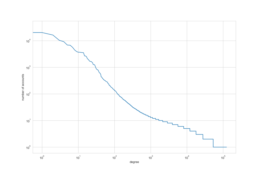
You can however get some interesting stats out from the entire network. For example, this plot shows the degree of connections on the x-axis axis and the number of accounts on the y-axis (all on a log10 scale). You can see that the majority of accounts have very few connections, i.e. they have not transacted with many other accounts. There are however a handful of accounts that are incredibly connected, having transacted with thousands of other addresses, I am guessing that these are the exchanges (and those spammers trying to get you to harvest on their node 😆). I have used networkit in the Jupyter Notebook linked from this post which includes a report on the larger network, it’s very mathsy but may be of interest to some of you.
Conclusion
OK, that’s enough, for now, thank you for reading to the end! 😅 I know that I went overboard on the plots but hopefully this article has provided you with a starting point to dig into Symbol and have a poke around 😁 Most of what I have presented here is fairly basic but if you have a burning desire to generate some particular stats then it should have equipped you with the tools you will need to go about getting them. If you decide to try out your own examples, then I would love to publish what you create on the blog, so please let me know!
This is the first time that I have worked with MongoDB and I have learned a ton about how to use it, how to do things in Python and perhaps most importantly I feel like I have really delved into Symbol and worked out how the data is represented and stored. These first couple of months on the pirate team have been a whirlwind but I have learnt so much. Thank you to the captains for answering my (mostly stupid) questions and to CryptoBeliever who helped me to find out which IP address MongoDB was running on in Docker! Expect some more articles from me in the new year but until then happy Christmas! 🎅🏼☃️
You can download a copy of my Jupyter Notebook here (it’s a bit messy 😅)
I’m a Symbol and NEM enthusiast and run this blog to try to grow awareness of the platform in the English-speaking world. If you have any Symbol news you would like me to report on or you have an article that you would like to publish then please let me know!


Sorry, the comment form is closed at this time.